Hi there! I was so excited to see the “Make it Monday” video on Nichole Heady’s blog today, because the featured technique is one I recently used when designing a set of Easter cards!
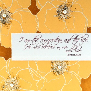
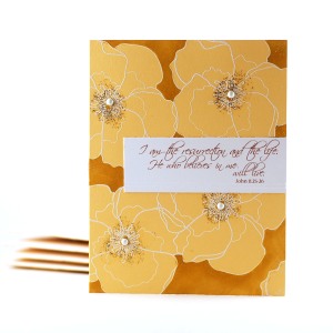
The technique I used was adding color (via copic markers for me) to a colored cardstock. I stamped PTI’s Harvest Gold cardstock with their Year of Flowers: Violets set using Versamark ink. Then, I heat embossed the stamped images with white embossing powder. Raising the image up with embossing really helps me when coloring – kind of provides more of a boundary, if you know what I mean. I colored the background using a Y26 copic and added some glossy accents, gold stickles, and white gems to the flower centers. A little printed sentiment with some scored lines finishes it off.
I think what pleased me most with this creation was that it turned out “clean and simple” while still feeling a bit “artsy”, too.

To see other’s takes on this technique, or to play along yourself, be sure to visit the link list on Nichole’s blog. Thanks for stopping in today!


Wow!! Your technique is amazing! Those flowers really pop off the page, very artsy!!
Absolutely GORGEOUS!!
Pretty,pretty violets. Love the sparkly centers. I’m sure the recipient will love it, especially with the wonderful sentiment.
This is just stunning!! I def have to try the negative-coloring technique!
This is beautiful, love the embossing!
so beautiful and elegant
i love how your flowers just pop off of the card :)
What a beautiful card, Susan! I especially love the color scheme. :)